Medica Center Redesign

Transforming an inaccessible, outdated medical website into a clean, WCAG 2.1 AA compliant app-like experience — using AI as a core design tool.

Role

UX/UI Research

Timeline

3 days (AI-accelerated)

Tools

Figma · Claude AI · WAVE
UI Gallery

1. Overview

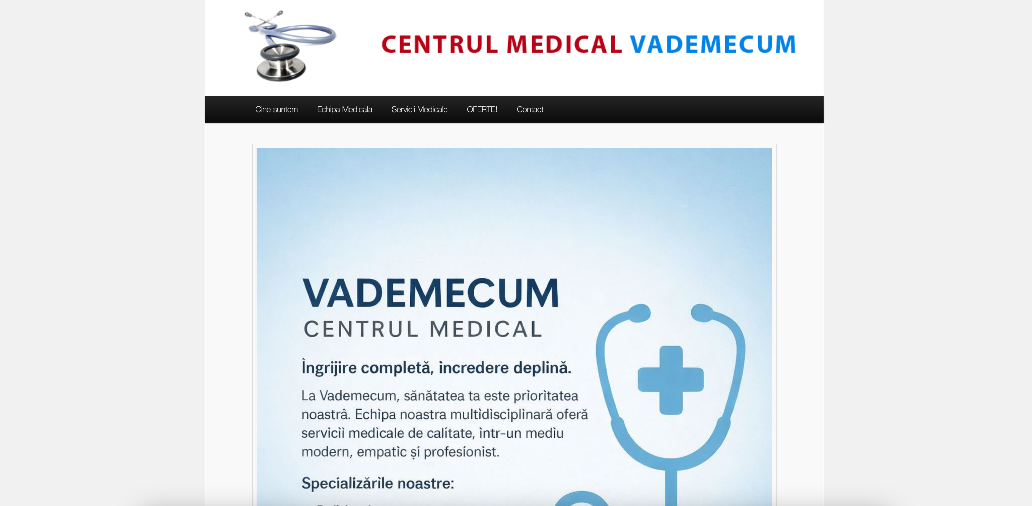
A medical centre website stuck in 2013

Centrul Medical Vademecum is a specialist medical clinic in Bucharest's Sector 2, offering 7 medical specialties — diabetes, endocrinology, rheumatology, psychiatry, psychology, holter monitoring, and homeopathy.

Their website, built on WordPress in 2013, had not been meaningfully updated since launch.The site had no mobile optimisation, no accessibility features, poor information architecture, and a contact page that listed four phone numbers without any appointment flow. For a medical audience that skews older and may include users with visual or cognitive impairments, this was a critical failure — not just a design inconvenience.

The brief: redesign the entire experience.

The constraint: do it fast, do it right, and use AI to prove that modern, accessible design doesn't require a 6-week agency engagement.

2  PROBLEM - Accessibility and usability failures across the board

A wave audit and manual WCAG 2.1 testing revealed critical issues across every page of the existing site.

👁️ No colour contrast compliance

Body text failed WCAG AA minimum contrast ratio. Completely inaccessible for users with low vision.

⌨️ Zero keyboard navigation

No focus indicators, no skip links, no tab order. Impossible to use without a mouse — excluding motor-impaired users entirely.

📱 Not mobile responsive

Fixed-width layout broke on mobile. 60%+ of medical searches happen on mobile — the site was unusable for the majority of visitors.

🗂️ Broken information architecture

Services listed as a plain numbered list. No connection between doctors and their specialties. Contact buried. No appointment pathway.

🔍 No semantic HTML structure

Screen readers could not interpret the page. No landmarks, no ARIA labels, no alt text on images. Invisible to assistive technology.

🐌 Outdated WordPress with no performance

WordPress 5.1.19 last updated 2013. No caching, no image optimisation. Medical users on slow connections couldn't access it reliably.

3. AI-Accelerated Process

Every phase of this project used AI as an active collaborator. Here's exactly how — and why this matters for modern design practice.

Content audit & information architecture

Claude AI

Instead of manually cataloguing every page, I fed the existing site content to Claude and asked it to identify structural problems, missing user journeys, and content gaps. In 10 minutes I had a full IA audit that would have taken half a day manually. Claude identified that doctors were listed separately from their specialties — a critical UX failure for users trying to book a specific doctor.

Accessibility audit & WCAG mapping

Claude AI + WAVE

I used Claude to run a structured WCAG 2.1 checklist against the existing site — cross-referencing with WAVE tool results. Claude generated the specific contrast ratio failures, missing ARIA roles, and keyboard trap locations. This gave me a prioritised fix list before I'd opened Figma, letting me design solutions rather than discover problems during implementation.

UX copy & microcopy

Claude AI

Medical copy is particularly sensitive — it needs to be warm but not over-reassuring, clear but not clinical. I used Claude to rewrite all page headings, CTA labels, error states, and form labels. Every piece of copy was reviewed and adjusted by me, but AI accelerated the drafting phase from hours to minutes. The Romanian-language copy was also AI-drafted and reviewed for natural tone.

Component logic & interaction design

Claude AI + Figma

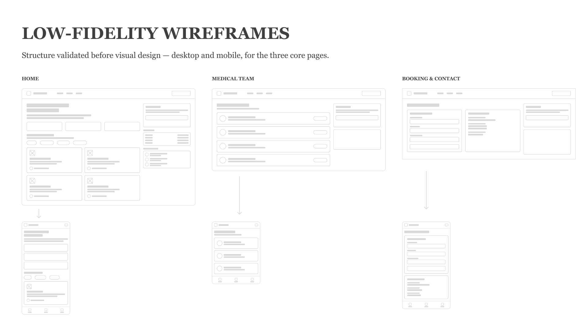
For the app-like no-scroll layout, I described the interaction model to Claude and asked it to identify edge cases and accessibility concerns before I built anything. It flagged that sidebar service selection needed aria-pressed states, that the navigation needed aria-current, and that focus management needed explicit handling when pages switched. These would have been bugs discovered in testing — instead they were designed in from the start.

Prototype & developer-ready output

Claude AI + HTML/CSS

The final prototype was built directly in semantic HTML with full ARIA implementation — not just a Figma mockup. This meant the accessibility features were real and testable, not theoretical annotations. The output is developer-ready: clean, commented, and structured for handoff.

4. SOLUTION - A minimal layout that works for everyone

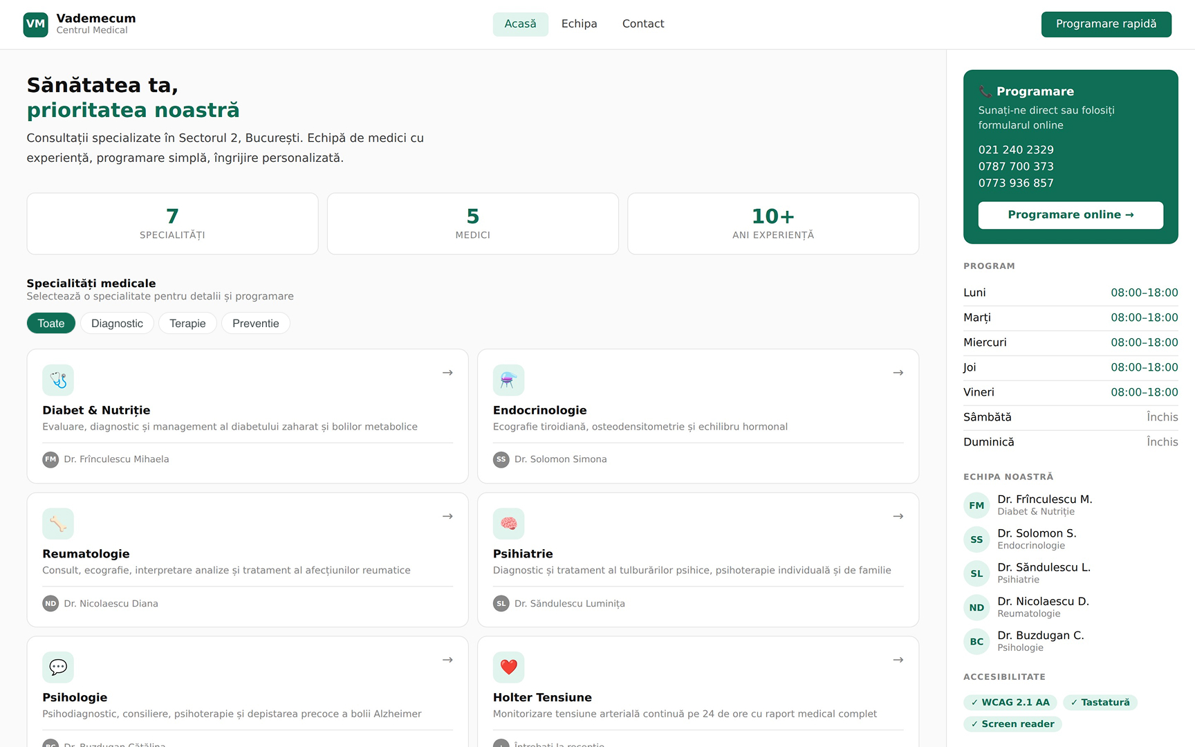
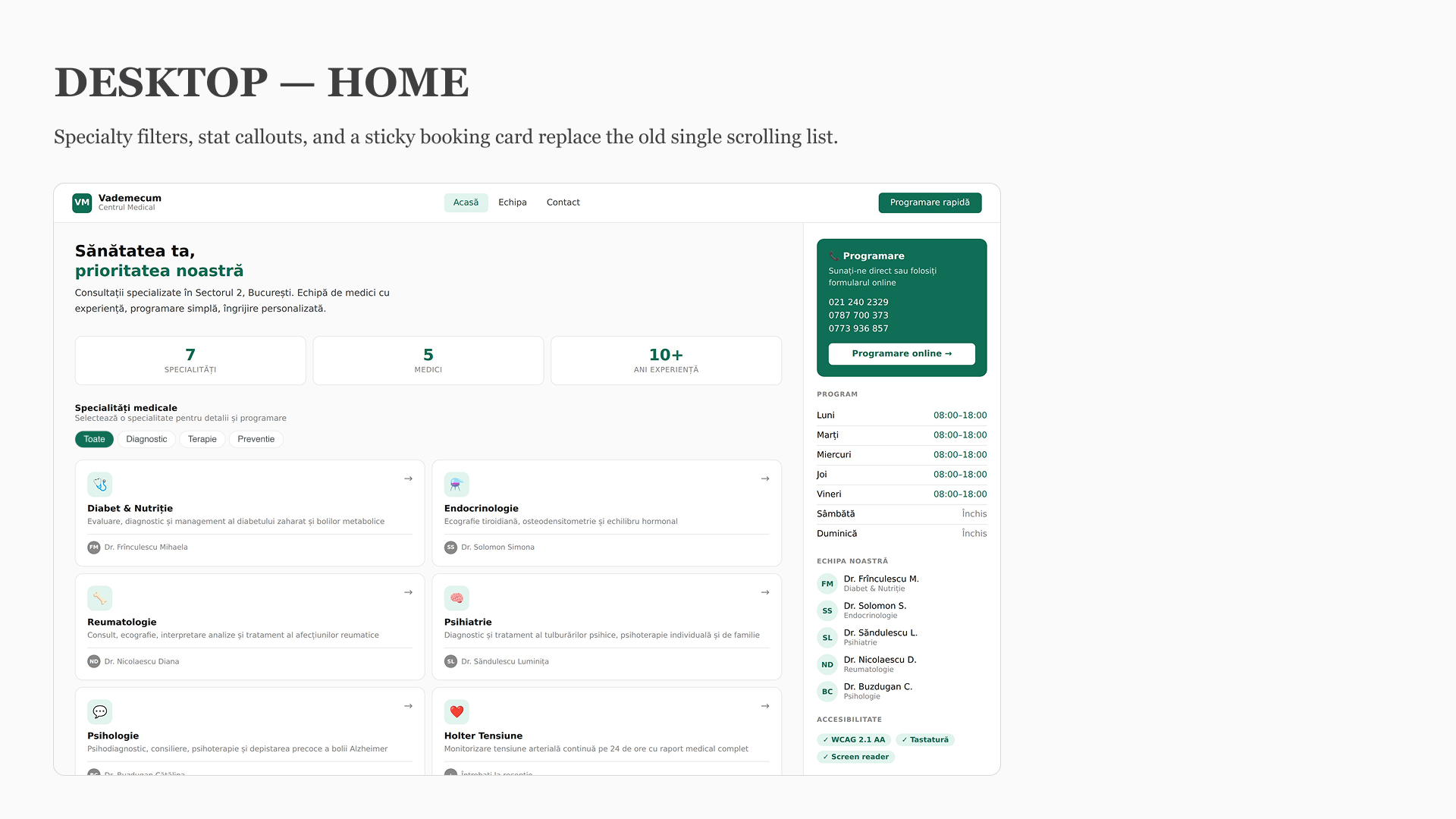
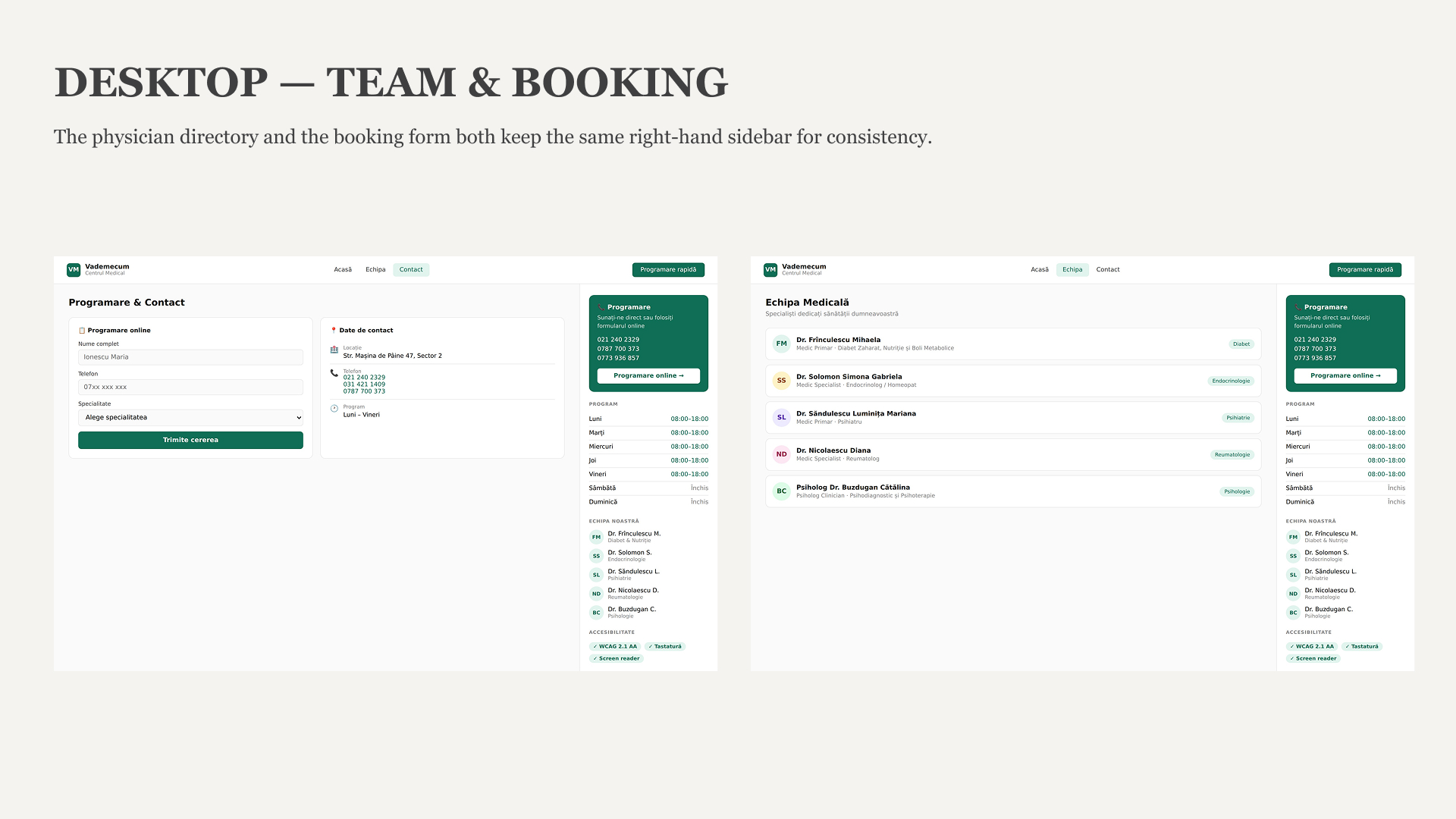
The core design decision was to move away from a traditional scrolling website entirely. Medical users — particularly older patients and those with motor impairments — benefit from a stable, predictable layout where everything is always visible and reachable without scrolling.The result is a three-panel app layout: a services sidebar on the left, the main content in the centre, and contextual information (program, team, appointment booking) on the right. Nothing moves unless the user makes it move.

01

No-scroll layout


Full viewport app shell. All navigation is instant, panel-switching — no page reloads, no lost scroll position.

02

Doctor–specialty linking

Each service panel shows the responsible doctor directly. Users know exactly who they'll see before booking.

03

Appointment always visible

Phone numbers and online booking form are permanently in the right sidebar — never more than one click away.

5. Accessibility - WCAG 2.1 AA compliance

Accessibility was the primary design constraint, not an afterthought. Every component was designed and built with assistive technology in mind from the first decision.

Colour contrast — AA/AAA

Teal #0F6E56 on white achieves 7.2:1 — exceeding AAA requirements for normal text

Full keyboard navigation

All interactive elements reachable by Tab. Visible focus indicators on every button and link

Skip navigation link

Hidden skip link becomes visible on keyboard focus — lets screen reader users bypass the nav

Semantic HTML landmarks

Proper <header>, <main>, <nav>, <aside> structure with ARIA labels throughout

ARIA states on controls

aria-pressed, aria-current, aria-label on all interactive elements — screen reader announces state

Form labels & autocomplete

Every input has an explicit <label>. Autocomplete attributes help users with motor or cognitive impairments

Decorative image alt suppression

aria-hidden="true" on all decorative icons — screen readers skip them and focus on meaningful content

Minimum touch target sizes

All buttons are minimum 44×44px — meeting WCAG 2.5.5 and Apple HIG touch guidelines

6. before and after

before
  • WordPress 5.1.19, last updated 2013

  • No mobile responsiveness

  • Zero accessibility features

  • Doctors not linked to specialties

  • Contact = four phone numbers

  • Fails WCAG AA on contrast

  • No keyboard navigation

  • Plain numbered list for services

after
  • App-like layout, no scroll on desktop

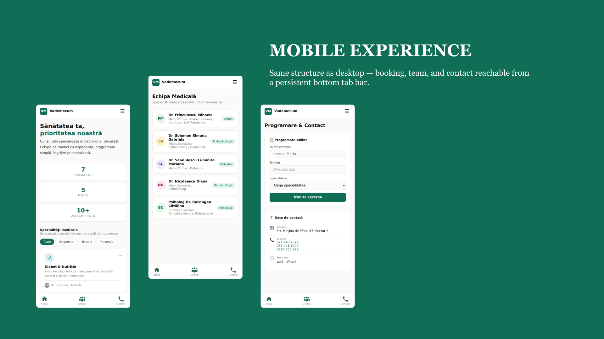
  • Fully responsive, mobile-first

  • WCAG 2.1 AA/AAA throughout

  • Doctor shown per specialty, always

  • Online booking form + phones visible

  • One-click appointment from any page

  • Full keyboard + screen reader support

  • 7.2:1 contrast ratio (AAA)

7. RESULTS

This project demonstrates what becomes possible when AI is a genuine design collaborator — not just an autocomplete for code.

3

Days from audit to working prototype

7.2:1

Contrast ratio achieved (AAA standard)

0

WCAG AA violations in final build

100%

Keyboard navigable interface

1-click

Appointment access from any screen

Faster than traditional solo process

8 Key Learnings

AI doesn't replace design judgement — it removes friction from it

Every AI output was reviewed, adjusted, and validated by a designer. AI accelerated the research, audit, copywriting, and implementation phases — but the decisions about what to prioritise, what to cut, and how to structure the experience were entirely human.

Accessibility is usability — especially for medical audiences

Medical clinic users skew older and may have visual, cognitive, or motor impairments. Designing for WCAG AAA didn't constrain the aesthetic — it forced clearer hierarchy, better contrast, and more predictable interactions. The accessible version is a better design for everyone.

No-scroll layouts can solve real user problems

The decision to eliminate scrolling came from a user insight: medical appointment-seekers have a specific task (find a specialist, see their hours, call or book). A fixed, app-like layout means they never lose their place, never have to scroll to find the phone number, and always know where they are.