VADEMECUM MEDICAL CENTER - UX & ACCESSIBILITY CASE STUDY

The site scored 100 for accessibility.
Patients still couldn’t book.

A live private clinic in Bucharest, open since 1995.
Brief: help stressed, unwell patients reach care quickly and confidently.

UI Gallery

Before

Lorem ipsum dolor sit amet, consectetur adipiscing elit. Suspendisse varius enim in eros elementum tristique. Duis cursus, mi quis viverra ornare, eros dolor interdum nulla, ut commodo diam libero vitae erat. Aenean faucibus nibh et justo cursus id rutrum lorem imperdiet. Nunc ut sem vitae risus tristique posuere.

After

Lorem ipsum dolor sit amet, consectetur adipiscing elit. Suspendisse varius enim in eros elementum tristique. Duis cursus, mi quis viverra ornare, eros dolor interdum nulla, ut commodo diam libero vitae erat. Aenean faucibus nibh et justo cursus id rutrum lorem imperdiet. Nunc ut sem vitae risus tristique posuere.

Role

01
Product Designer

Scope

01
UX → UI → accessibility

Focus

01
Patient access

Platform

01
Responsive website

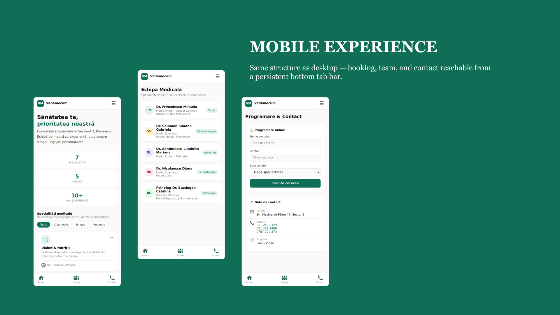
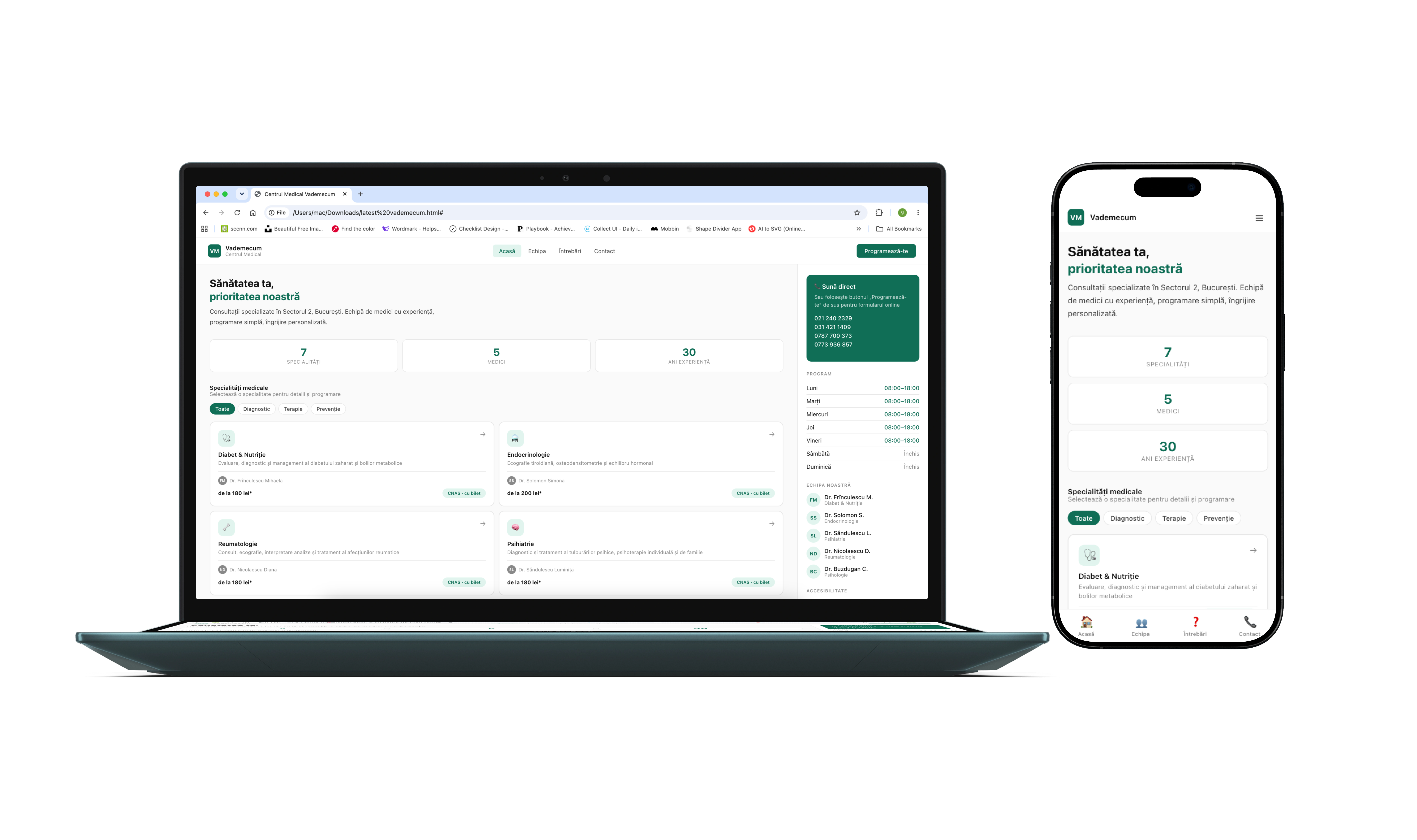
Medical Vademecum is a private outpatient clinic in Bucharest, operating since 1995. The redesign focused on the moments before a patient contacts the clinic: understanding what is offered, what it costs, whether it’s covered, and how to get in touch.

THE  PROBLEM

The automated score looked healthy.The patient experience wasn’t.

99

Performance

100

Accessibility

85

SEO

Lighthouse suggested the site was healthy.A manual audit showed otherwise.

Meet Radu

34
New patient
Comparing clinics
“Is this covered by my insurance, how much will it cost, and how soon can I be seen?”

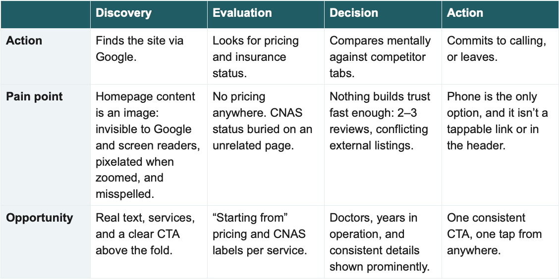
Radu found the clinic through Google, searching “reumatolog București” for new joint pain. He wants to know in under a minute whether it’s CNAS-covered or private-pay, roughly what it costs, and how soon he can be seen or he’ll call the next clinic on his list.

‍Where the site breaks down: no pricing anywhere; CNAS status mentioned once, buried on an unrelated “about us” page; and the phone number he’d have to call can’t be tapped.

His journey

Findings

01
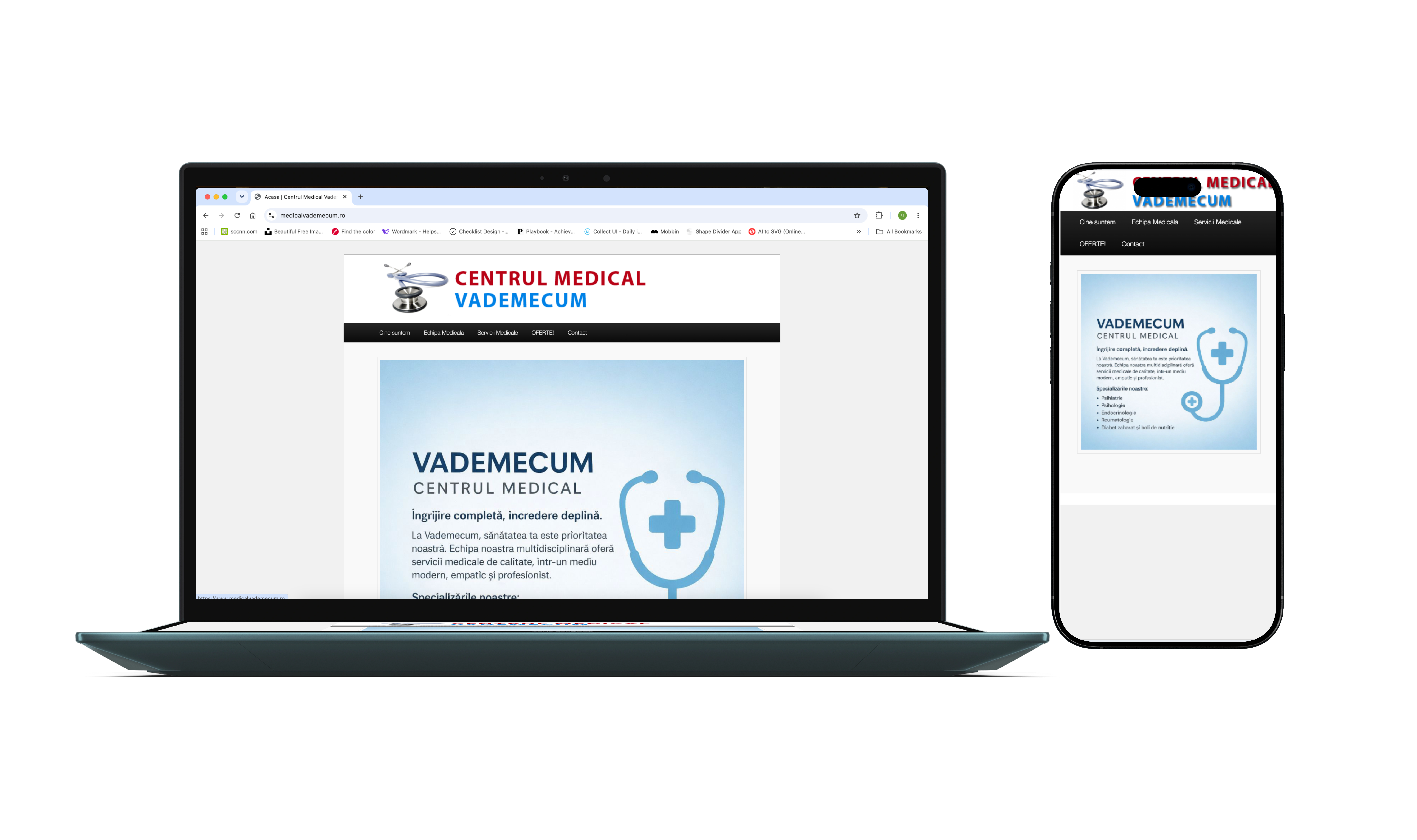
The homepage's only real content was a picture of text
‍
‍
The tagline, description, and full specialty list were a single image with empty alt text. Lighthouse scored it 100/100: alt="" is valid syntax, and the tool checks that the attribute exists, not whether hiding the image removes the page's meaning.Screen readers got nothing (WCAG 1.1.1), it pixelated at 200% zoom (1.4.5), Google couldn't index it, and staff couldn't edit it. It was also misspelled: Italian and Spanish accents in place of Romanian diacritics (prìoritatea, servicìi, Psihiatríe). No tool catches that, because the words are pixels. It took only a native speaker looking.
02
The only way to book was broken on mobile

‍
Every appointment starts with a call, but the number was plain text, not a tel: link, and absent from the header. On mobile a patient had to memorise it, open the dialer, and type it. No automated tool flags this: the markup is valid and the page is fast. The conversion path just doesn't work.
03
Cost and coverage were nowhere

‍
No pricing exists. Regina Maria, MedLife, and Sanador all show expected cost and offer online booking; Vademecum offers neither, so a patient like Radu (34, comparing clinics) fails his one-minute test before he reaches the phone number.
04
Trust signals were thin and inconsistent

‍
A directory listing still shows 2 locations, 8 specialties, and 10 doctors; the live site has 1, 7, and 5. Only 2–3 reviews exist for a clinic open since 1995.
How i investigated the problem

Audit
Manual Review
Content
Benchmark
Journey

What patients could expect elsewhere

Online booking
Price before contact
Regina Maria
✅
✅
MedLife
✅
✅
Sanador
✅
✅
Vademecum
❌
❌

Design principles

01
Show cost and coverage before commitment
02
One source of truth
03
Every page leads to action
04
Reassure before asking someone to act
05
Real content, not images
06
WCAG AA as the baseline

The new patient flow

Home
Speciality
Contact
Confirmation
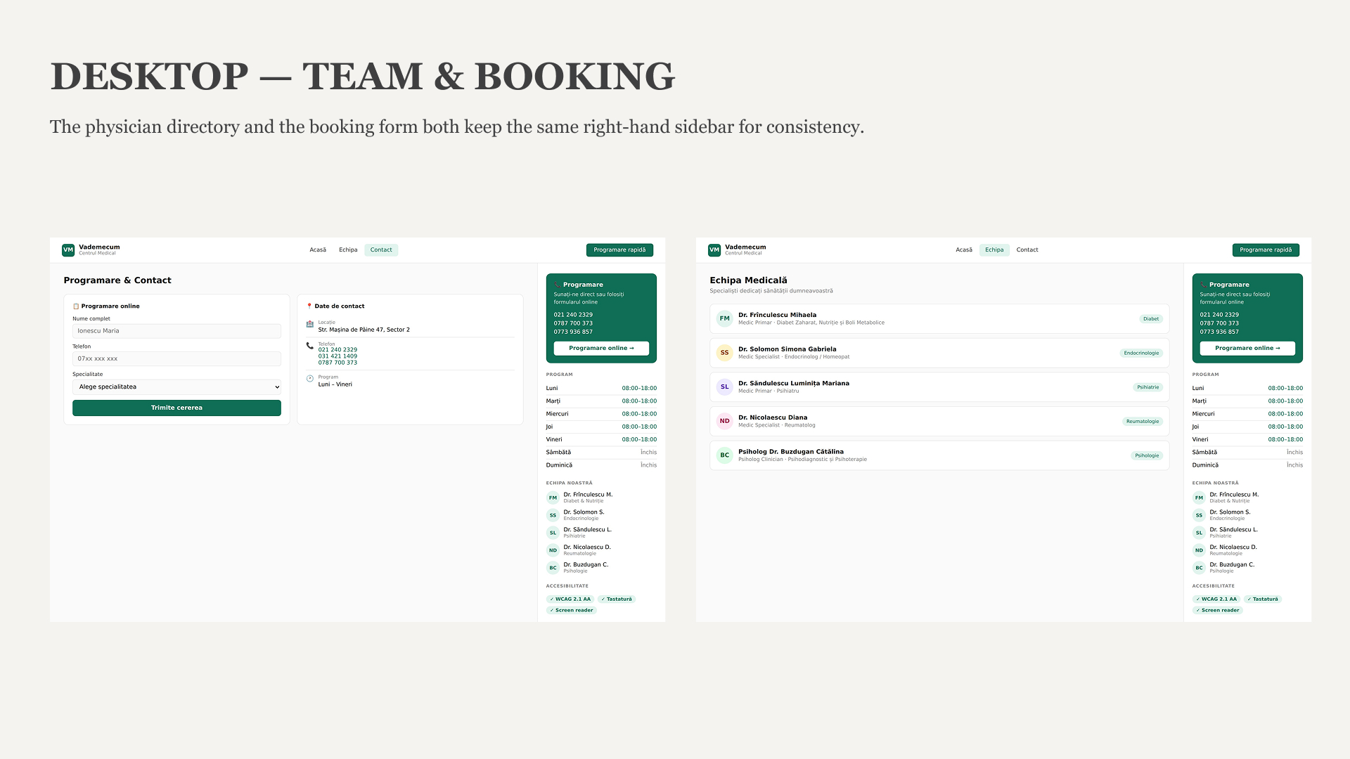
Radu can understand the service, see cost and coverage, and reach the clinic without leaving the flow.

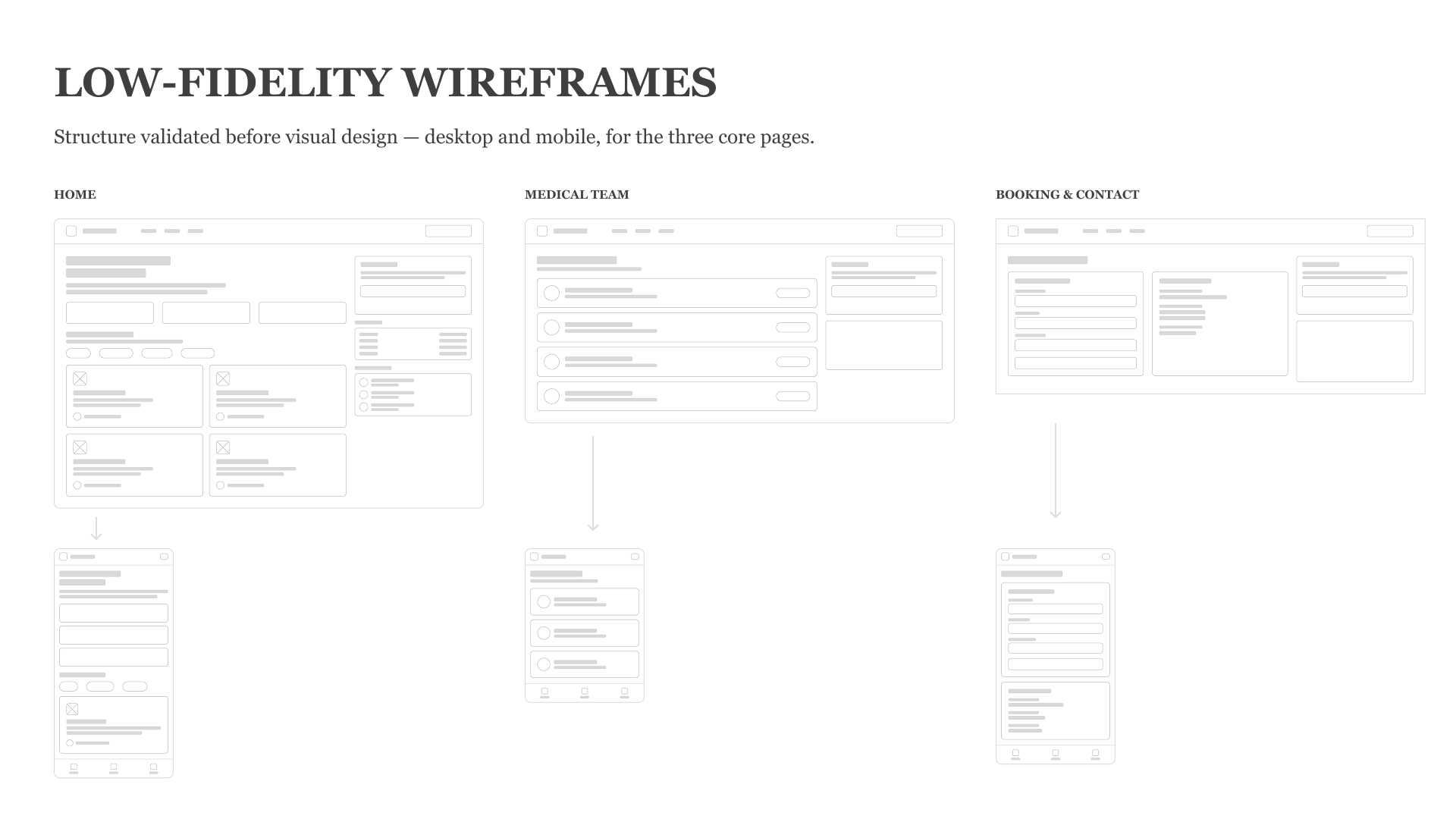
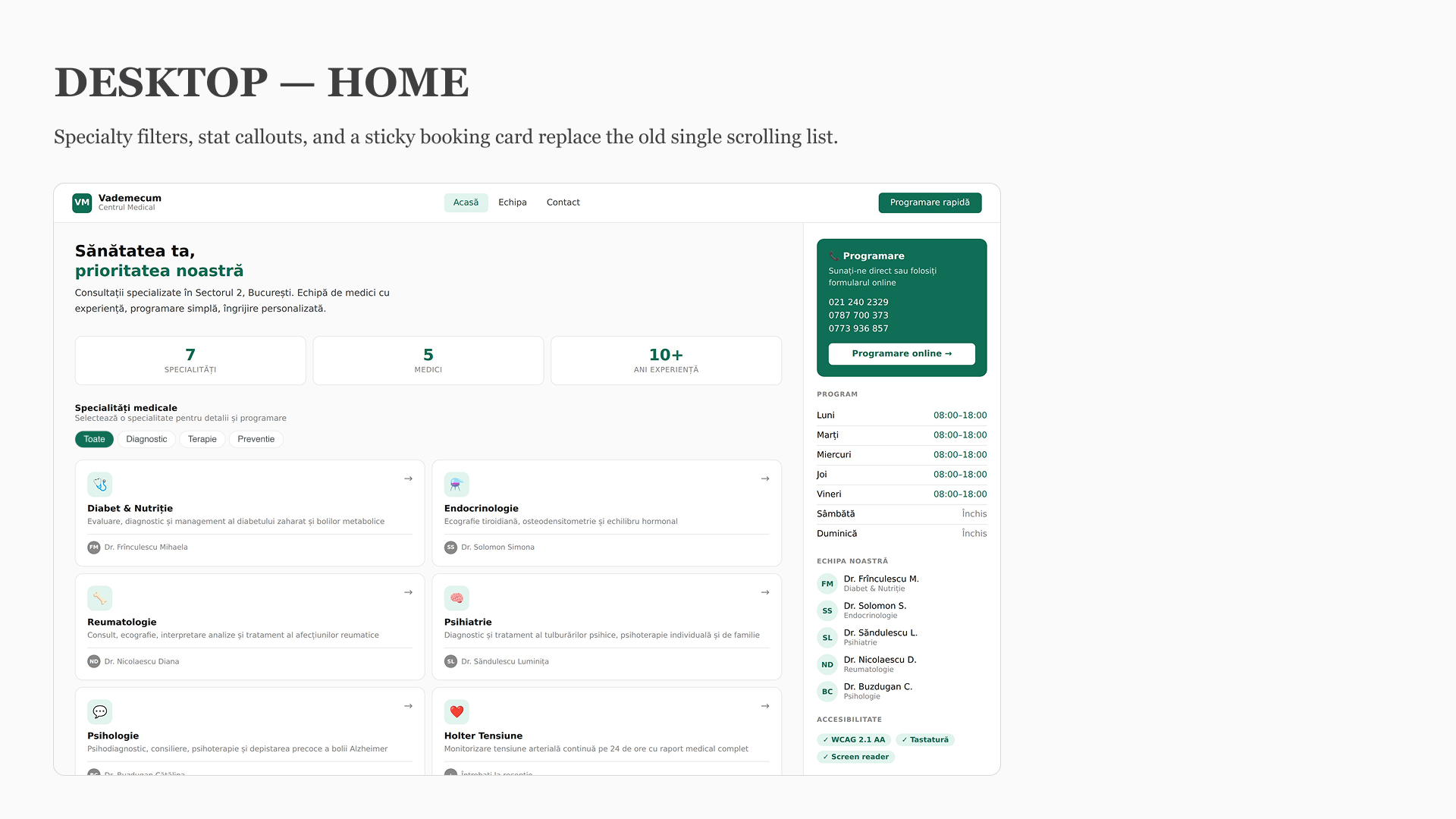
From structure to interface

Low fidelity
Home
Home
Home
High fidelity
Home
Home
Home
01
REAL TEXT
Show cost and coverage before commitment
01
TAP TO CALL
Show cost and coverage before commitment
01
Show cost and coverage before commitment

Accessibility isn't a checklist

I treated accessibility as part of the interface, not something to check after visual design.

Contrast

Structure

Heading hierarchy
Landmarks
H1
Page title
H2
Section title
H3
Subsection
H4
Content

Interaction

Focus states
Keyboard navigation

Content

Real HTML text instead of images